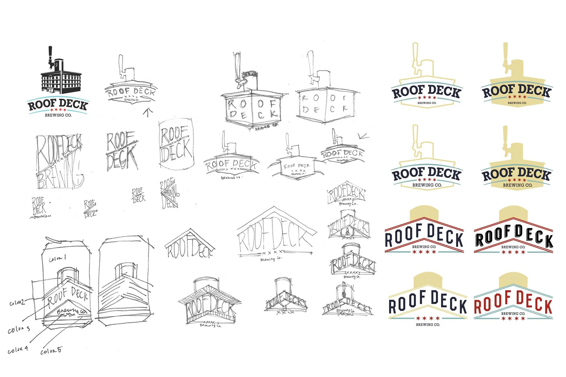
Roof Deck Brewing
Small Batch Brewing Co. — Package Design Exploration
Graphic Design + Creative Direction
I partnered with a small batch brewing company in Chicago to reimagine their packaging and refine their existing brand identity. The goal was to modernize their look while staying true to their roots and love for the city.
Two design directions were explored:
Refined Original – This concept builds on the brewery’s original logo and early design ideas, tightening the layout and introducing iconic Chicago elements like the city flag stars and bold, civic-inspired colors.
City Grid Series – A more conceptual approach inspired by a bird’s-eye view from a rooftop deck overlooking Chicago streets. Each flavor of beer is tied to a specific neighborhood or landmark, with a color palette drawn from the city’s transit lines to give each brew a unique, location-based identity.
These mockups showcase different ways to evolve a local brand story into something visually distinctive and scalable.
Timeline: Few Hours